Eye-catching banners, more than just rectangles. Learn how to create website banners that grab attention, communicate clearly, and drive conversions.
Challenge
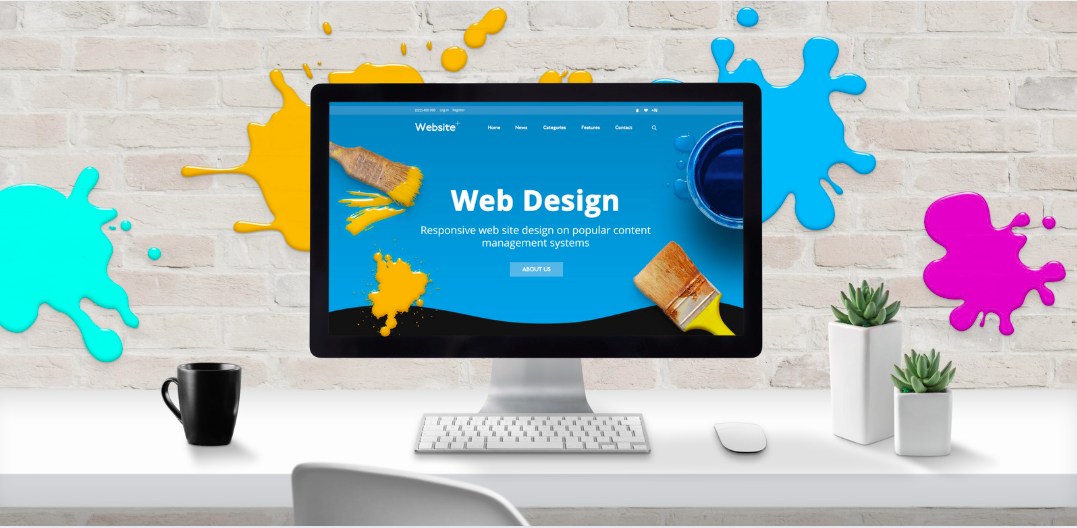
Web banners seem simple, right? A rectangle, some words, and voilà! Except… they often flop harder than a bad first date. Poorly designed banners don't just fail—they actively drive people away. The challenge? Make something that grabs attention, speaks your brand, and doesn't scream, "Skip me!"
I've seen businesses throw banners together in five minutes with zero planning, all hoping. Spoiler: That doesn't work. In a sea of pixels, your banner's got one shot to stand out and get clicks. Game on.
Research
When I started exploring competitor's banners, two things became clear: Some hit it out of the park with bold fonts and stunning images; others were an all-caps nightmare. Trends point to clean designs with sharp calls-to-action (CTAs) and minimal clutter.
I also noted a major gap: personality. Most banners scream "SALE!!" but lack any soul. It's the equivalent of a bad handshake. So, how do you bring warmth to your pixels? Let's get creative.
Solution
The best banners are like good storytellers—short, engaging, and memorable. Use bold typography, keep the color palette tight (and on-brand), and make sure your CTA glows like it was blessed by design wizards. Less is more; trust me.
Oh, and images? No stock-photo nightmares. If it doesn't feel unique, don't use it. Think relatable, think human. A quirky graphic can say more than a thousand desperate "Click here!" buttons. Another thing, try to add text as HTML tags, not design it on banner directly. Why? You want Google or Bing to read your tags directly, not guessing!
Set Objectives
Let's measure success, shall we? Objectives can include a 15% boost in clicks, a bounce rate below 30%, or even user surveys to rate design appeal. The goal: measurable results, not just "looking pretty."
Keep an eye on conversion rates. A banner's purpose isn't to decorate the site—it's to drive action. Let's focus on results that make the boss grin.
Get Resources
Great design needs the right tools and people. Invest in tools like Adobe Creative Suite or Canva Pro. Have at least one designer with a sharp eye for trends (and a low tolerance for Comic Sans).
And don't forget time—rushed banners are bad banners. Trust me, spending extra hours refining design beats throwing spaghetti at the wall.
Evaluate Results
Once the banner's live, dig into analytics. Are people clicking? Are conversions up? If not, tweak and test. Sometimes, a small adjustment—like tweaking font size (it's gotta be more than 18px at least)—makes all the difference.
Celebrate what works and learn from the flops. In the end, banner design is all about experimenting until it clicks—literally.
Best Practices for Website Banner Design
- Keep it simple and clean: Avoid clutter and focus on one clear message with minimal text and strong visual hierarchy
- Use bold, on-brand typography: Choose fonts that reflect your brand personality and are easily readable at various sizes
- Maintain consistent color palette: Stick to 2-3 brand colors to create visual cohesion and professionalism
- Create compelling CTAs: Make your call-to-action button stand out with contrasting colors and action-oriented copy
- Use HTML text, not image text: Add text as HTML tags so search engines can read and index your content directly
- Avoid generic stock photos: Use unique, authentic images that feel human and relatable to your audience
- Ensure minimum 18px font size: Text should be easily readable without squinting, especially on mobile devices
- Test multiple variations: A/B test different designs, CTAs, and layouts to find what resonates with your audience
- Optimize for mobile: Ensure banners are responsive and look great on all screen sizes and devices
- Add personality to design: Inject brand character and warmth into your banners to stand out from competitors
- Keep load times fast: Optimize image files for web to prevent slow loading that drives users away
- Create visual contrast: Use contrasting elements to guide the eye and emphasize key information
- Monitor analytics consistently: Track click-through rates, bounce rates, and conversions to measure effectiveness
- Align with campaign goals: Design banners that directly support specific marketing objectives and user actions
- Iterate based on data: Continuously refine designs based on performance metrics and user feedback

Johnson Wang
Digital Marketing Specialist & Software Developer with 10+ years of experience helping businesses grow through strategic marketing and custom development solutions.
Contact Me