The Day I Realized I Was Designing the Same Button for the Fifth Time
There was a period when every new page I designed felt strangely familiar. Not in a good "consistent" way — more like déjà vu mixed with mild frustration. I was recreating the same button styles, the same cards, the same form fields again and again. Each version was slightly different, and those tiny differences slowly turned into visual drift.
The turning point came when I finally paused and built a small component library. What surprised me wasn't just the time saved — it was the clarity gained. Instead of designing screens, I was designing building blocks. The interface stopped feeling like scattered pages and started feeling like a system with its own vocabulary.
Thinking in Layers Instead of Pages
A strong UI component library isn't just a collection of random widgets. It's layered, almost like architecture. Each layer has a different level of responsibility and reusability. Once I started thinking this way, design decisions became faster and more intentional.
Layer 1 — Foundations (The Atoms)
These are the smallest visual ingredients. Individually simple, but together they define the visual DNA. Examples include:
- Color tokens
- Typography styles
- Icon sets
- Spacing scales
- Border radius rules
- Shadows
- Grid units
- Breakpoints
- Line heights
- Opacity levels
They rarely appear alone, but everything else depends on them.
Layer 2 — Basic UI Elements (The Molecules)
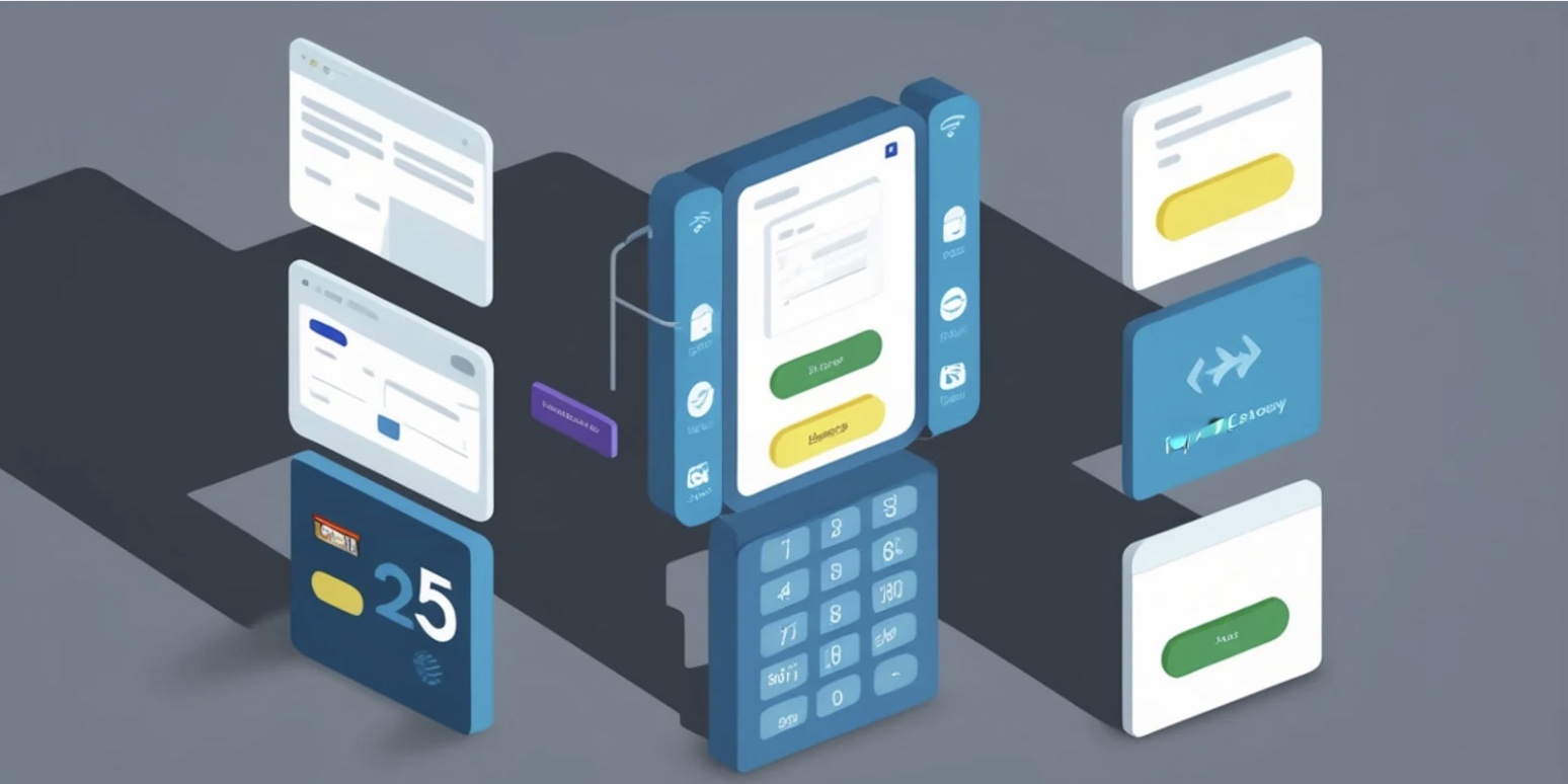
This layer combines foundations into interactive or visible pieces users directly notice. These are the components I used to redesign repeatedly before building a library.
Common UI components here include:
- Primary button
- Secondary button
- Tertiary button
- Icon button
- Text input
- Password input
- Checkbox
- Radio button
- Toggle switch
- Dropdown select
- Slider
- Progress bar
- Badge
- Chip / Tag
- Tooltip
- Avatar
- Divider
- Label
- Link
- Icon container
At this stage, components start communicating behavior rather than just style.
Layer 3 — Composite Components (The Organisms)
These are clusters of smaller components working together to complete a user task. This is where interfaces begin to feel functional rather than decorative.
Examples include:
- Navigation bar
- Sidebar menu
- Breadcrumbs
- Search bar
- Pagination control
- Modal dialog
- Toast notification
- Alert banner
- Accordion
- Tabs
- Carousel / Slider gallery
- Card layout
- Pricing table
- Data table
- Form group
- Comment box
- Chat bubble
- Stepper / Wizard
- File upload box
- Date picker
These pieces often become the most reused structures across different pages.
Layer 4 — Layout & Page Patterns (The Templates)
This layer isn't always listed in libraries, but it's where design systems mature. These patterns shape full experiences rather than single interactions.
Typical layout components include:
- Hero section
- Feature grid
- Footer
- Header bar
- Dashboard panel
- Profile layout
- Checkout flow
- Blog post layout
- Product detail section
- Empty state screen
At this level, components stop being isolated tools and start forming journeys.
Why a Component Library Changes Everything
The biggest shift isn't efficiency — though that alone is significant. The real impact is cognitive. Instead of inventing new visuals for every screen, you begin assembling from a trusted set. Consistency emerges naturally rather than being enforced. Collaboration improves because designers and developers share the same visual language.
There's also a psychological benefit for users. When buttons, inputs, and navigation behave predictably across pages, the interface feels trustworthy. The brain doesn't need to relearn patterns, which reduces friction and increases confidence.
What Stays With Me
A component library isn't just a toolkit; it's a philosophy of thinking in systems rather than surfaces. Each component becomes a word, each layout a sentence, and each page a paragraph in the same visual language.
Looking back, the moment I built my first structured library was the moment design stopped feeling repetitive and started feeling intentional. Interfaces became less about drawing new shapes and more about composing familiar ones into meaningful experiences. In the end, a strong component library doesn't limit creativity — it gives creativity a stable foundation to grow from.