A Small Moment That Changed How I See Text
A few years ago, I was reviewing a landing page that technically “worked.” The buttons functioned, the images loaded, and the content was correct. But something felt off. The headline looked heavy, the paragraph spacing felt cramped, and the call-to-action almost disappeared into the layout. Nothing was broken — yet nothing invited the reader in.
Out of curiosity, I changed only three things: font weight, line height, and letter spacing. I didn’t touch the colors or images. Suddenly, the page breathed. The same words felt more confident, clearer, and oddly more trustworthy. That was the moment I realized typography isn’t decoration — it’s tone of voice without sound.
The Details Most People Don’t Notice (But Feel)
Typography works like body language. You rarely analyze it consciously, but you instantly react to it. A slightly tighter line height can make content feel urgent or stressful. A lighter font weight can feel elegant but also fragile if overused.
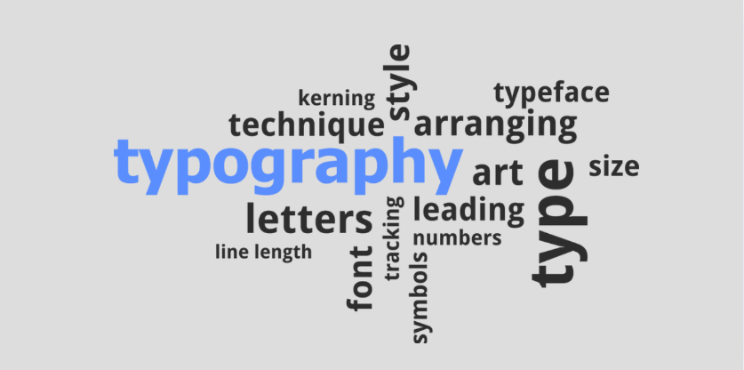
When I think about typography guidelines, I usually focus on a few micro-decisions:
- Hierarchy: Headlines should guide the eye, not compete with each other.
- Spacing: Line height and paragraph gaps create rhythm — like pauses in speech.
- Consistency: Repeating the same font family builds familiarity and trust.
These are small levers, yet they dramatically influence readability and emotional response. Good typography doesn’t shout; it whispers clearly.
Typography as Brand Psychology
Stepping back, typography is less about fonts and more about identity. The same sentence written in a geometric sans-serif versus a classic serif can suggest two completely different brands — modern tech startup versus established institution, for example.
In professional environments, typography guidelines act like guardrails. They ensure that whether a message appears on a website, a slide deck, or a social post, it still “sounds” like the same organization. Consistency reduces cognitive friction. Readers don’t need to re-interpret tone each time; they subconsciously recognize it.
This is why typography guidelines are often embedded into design systems. They protect clarity, speed up collaboration, and prevent visual drift when multiple people create content. It’s less about strict control and more about shared language.
Typography is one of those elements people only notice when it’s wrong, yet it influences perception every second it’s right. It shapes how professional, friendly, bold, or trustworthy a message feels before a single word is fully read.
Takeaway
The practical takeaway is simple: treat typography decisions as communication choices, not just aesthetic ones. Adjusting line height or font weight is not merely styling — it’s editing the voice of your content.
When guidelines are thoughtful rather than rigid, they become a quiet partner in every design. They allow creativity to happen within a structure, and they make sure the message always arrives with the tone you intended. In the end, typography isn’t about choosing pretty letters; it’s about giving your ideas a consistent and confident voice.