Spacing and Margin
The Day “Nothing” Fixed Everything
I once worked on a product page where the client kept saying, “It just feels crowded.” The typography was correct, the images were sharp, and the colors were balanced. We tried changing fonts, adjusting button styles, even swapping visuals — nothing really solved the discomfort. Out of mild frustration, I increased the margin between sections, added more line spacing to the paragraphs, and intentionally left certain areas empty. That was it. The page suddenly felt premium, breathable, and easier to read. What changed wasn’t the content itself, but the space around it. It reminded me that sometimes the most powerful design decision is adding what looks like “nothing,” but functions as clarity.
The Precision Behind the Gaps
Spacing and margin often get treated as finishing touches, yet they directly affect readability and perceived quality. Margin defines the outer breathing room of elements, while padding controls the inner comfort within containers. When margins are too tight, content begins to visually collide; when they’re thoughtfully balanced, each section feels intentional and digestible.
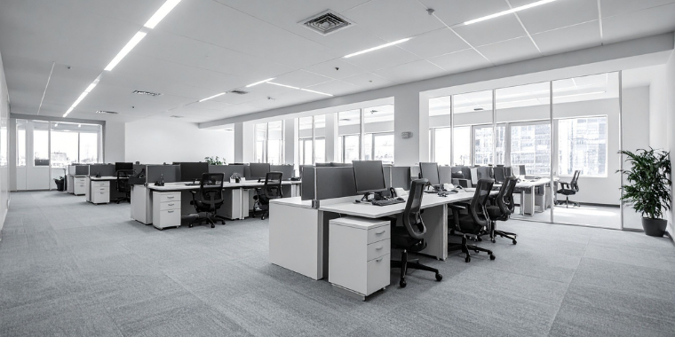
In practical use cases, spacing changes how users scan a page. Increasing vertical spacing between feature cards can make each item feel distinct and easier to process, especially on mobile. Horizontal spacing prevents text blocks and buttons from feeling glued together. Many teams even adopt consistent spacing scales — such as 8-pixel or 12-pixel increments — to create rhythm and predictability. These micro-decisions may seem invisible, but they subtly shape how professional and organized a layout appears.
The Bigger Picture of Negative Space and Visual Guidance
Stepping back, spacing connects closely with the idea of negative space, often called white space. This is the intentional empty area that surrounds elements and quietly guides visual attention. Rather than being wasted space, it acts like a spotlight. When an image or headline is surrounded by openness, the eye naturally gravitates toward it without force.
There’s also a psychological dimension. Humans interpret generous space as confidence and quality, which is why luxury brands often use minimal layouts with large margins. Dense pages can feel efficient, but when overfilled, they create cognitive fatigue. Negative space functions like pauses in conversation — it gives the viewer a moment to absorb information before moving forward. Without these pauses, even strong content can feel overwhelming.
What Stays With Me
Spacing and margin are less about emptiness and more about intention. They control flow, emphasize hierarchy, and influence emotional comfort before a single sentence is fully read. A thoughtful layout doesn’t aim to fill every pixel; it understands that restraint can amplify clarity.
Now, whenever I refine a design, I pay as much attention to the empty areas as the visible ones. Adjusting a few pixels of margin or introducing deliberate white space can transform tension into calm and clutter into elegance. In the end, negative space isn’t absence — it’s the invisible guide that helps everything else be seen.