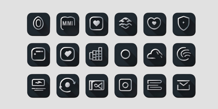
Iconography
The Moment a Tiny Symbol Spoke Louder Than Text
I once worked on a dashboard where we carefully wrote labels for every action — “Download Report,” “Share File,” “Archive Item.” Everything was clear, yet the interface felt crowded and heavy. Out of curiosity, I replaced a few repeated labels with simple icons while keeping tooltips for clarity. Suddenly, the screen felt lighter and faster to scan. What surprised me wasn’t just the extra space we gained, but how quickly users understood the actions without reading. That was the moment I realized icons are not just visual shortcuts; they are a language of their own.
The Craft Behind a Simple Shape
At first glance, icons look straightforward — small lines and shapes placed beside text. But effective iconography is deeply tied to proportion, geometry, and visual consistency. Stroke thickness, corner radius, and grid alignment all influence whether a set feels cohesive or scattered. Even a one-pixel difference in line weight can make an icon feel either sharp or clumsy.
There’s also a semiotic layer — the study of signs and symbols. An envelope suggests email, a magnifying glass suggests search, a trash bin suggests deletion. These associations are learned through repeated exposure across digital products. When designers choose familiar metaphors, users process meaning almost instantly. When metaphors are obscure or overly abstract, comprehension slows down, and friction appears.
The System Behind Recognition
Looking at the broader picture, iconography works best when treated as a system rather than individual artwork. Consistent style — filled versus outlined, rounded versus sharp, minimal versus detailed — builds visual harmony and brand identity. Mixing styles can unintentionally signal inconsistency, even if each icon looks good on its own.
Icons also influence cognitive load. Well-designed symbols reduce reading effort and speed up navigation, especially in dense interfaces. However, overusing icons without labels can create ambiguity, particularly for new users or cross-cultural audiences. Balance is key: icons should enhance clarity, not replace understanding. In many cases, pairing icons with short text creates both speed and confidence.
What Stays With Me
Iconography is less about decoration and more about communication efficiency. A strong icon set acts like a silent guide, helping users move through an interface with less effort and more intuition. The goal isn’t to impress with complexity, but to achieve instant recognition and harmony.
Whenever I design or evaluate icons now, I think about them as vocabulary in a visual language. Each symbol needs clarity, consistency, and context. When these elements align, icons stop feeling like small graphics and start functioning as meaningful signals — quietly shaping how smoothly people understand and interact with a product.