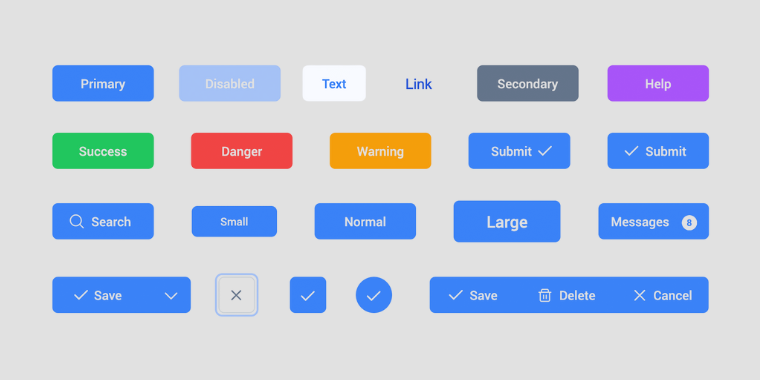
Buttons
I once redesigned a landing page where conversions were lower than expected. The layout was clean, the copy strong, and the visuals appealing, yet users weren’t clicking. After observing the interface more closely, I realized the main call-to-action button looked almost identical to secondary links. It didn’t stand out, didn’t invite action, and didn’t clearly signal importance. When I increased its size slightly, adjusted the contrast, and refined the hover interaction, engagement noticeably improved. It reminded me that buttons may be small components, but they carry the weight of decision-making moments.
The Details That Shape Interaction
Buttons are not just rectangles with text; they are signals of intent. Size, spacing, and typography all influence how clickable and trustworthy a button feels. A slightly larger primary button often communicates confidence and importance, while smaller secondary or tertiary buttons suggest optional paths.
Variants also matter. A primary style typically uses stronger contrast and solid fills to draw immediate attention. Secondary styles often rely on outlines or softer tones to support actions without competing. Tertiary styles, such as text buttons, quietly exist for less critical interactions. Color psychology plays a subtle role here too — brighter or warmer hues can energize action, while cooler tones may feel stable and reassuring. The key is ensuring the visual weight matches the action’s importance.
Interaction feedback is equally critical. Hover states, pressed states, and subtle animations act like non-verbal responses. When a button changes shade or elevation on hover, it reassures the user that the interface is responsive. Without this feedback, even a well-designed button can feel lifeless or uncertain.
The Bigger Picture of Consistency and Trust
Looking beyond individual screens, buttons are part of a larger design language. Consistency in shape, border radius, spacing, and color builds familiarity. When users encounter the same style repeatedly, they learn what to expect and act with less hesitation. Inconsistent buttons, on the other hand, create friction because the brain must re-interpret meaning each time.
From a systems perspective, defining button guidelines early makes collaboration smoother. Designers, developers, and marketers can all work faster when there is a shared understanding of primary, secondary, and tertiary styles. This consistency doesn’t eliminate creativity; it provides a reliable baseline that keeps the experience cohesive as products grow.
What Stays With Me
Buttons represent commitment points — the moments where a user decides to proceed, submit, purchase, or explore. Their effectiveness lies not in flashy colors or complex effects, but in clarity and confidence. A thoughtful button design quietly communicates hierarchy, intention, and responsiveness all at once.
Whenever I design interfaces now, I treat buttons less like decorative elements and more like conversations. Their size speaks volume, their color sets tone, and their interaction gives reassurance. When these elements align, the experience feels natural, and users move forward without second-guessing — which is often the ultimate goal of good design.